
The default editor used for editing content in Presence is RadEditorAjax. This is a rich-text editor that allows for easy creation of web content (often referred to as a What You See is What You Get, or WYSIWYG, editor).
The editor functions in a way somewhat similar to Microsoft Word and therefore many of the icons and features available will seem familiar to most users. In addition to having the ability to alter the look of text on a page, users can also insert links, images, embed videos and more. Furthermore, for the technically savvy, the editor allows the ability to view and edit the HTML for your content directly.
Editor at a Glance
The following table provides a definition and function for all the icons available in the editor. Administrators can adjust which of these buttons appear in the editor. Instructions on how to do so can be found in the Text Editor Settings section of the Presence Administrator Guide.
|
Button in Text Editor Settings |
Button in Text Editor |
Description |
|---|---|---|
|
|
Find and Replace: This function allows you to search for and replace text within the portlet. |
|
|
Paste from Word, Strip Font: This button allows you to paste text copied from Microsoft Word while stripping the fonts from the original document. |
|
|
Paste HTML: This button will allow you to insert HTML code on to the page. This can be quite useful if you want to add a third-party widget. |
|
|
Undo: This button allows you to undo your last action(s) on a page. |
|
|
Redo: This button allows you to redo the action or actions that were undone. |
|
|
Insert Image: This tool allows you to insert an image in the content box. |
|
|
Media Manager: You can use this tool to insert media onto your page, such as MP3 audio files, AVI video files. |
|
|
Insert File: This tool allows you to insert links to documents on to your page such as PDF files, Microsoft Word files, Microsoft Excel files to name a few. |
|
|
Insert External Video: This tool allows you to insert embedded videos on your page. |
|
|
Hyperlink: This tool allows you to link selected text to another website or document. |
|
|
Remove Link: This tool allows you to remove a hyperlink from a text. |
|
|
Bold: This button allows you to bold text. |
|
|
Italicize: This button allows you to italicize text. |
|
|
Underline: This button allows you to underline text. |
|
|
Bullets: This tool allows you to create bulleted lists. |
|
|
Numbered: This tool allows you to create numbered lists. |
|
|
Increase Indents: This button allows you to increase indents (tabs) for your paragraphs. |
|
|
Decrease Indents: This button allows you to decrease indents for your paragraphs. |
|
|
Left Align: This tool aligns your text to the left. |
|
|
Center Align: This tool center aligns your text. |
|
|
Right Align: This tool aligns your text to the right. |
|
|
Insert Table: This tool allows you to insert tables in your content box. A popup menu will appear prompting you to select the dimensions of your table. |
|
|
Text Color: This button allows you to change the color of text on your page. |
|
|
Remove Formatting: This option allows you to clean up formatting tags on selected content. |
|
|
Paragraph Style: This button allows you to customize the style of text on your page. |
|
|
New Paragraph: This button allows you to create a new paragraph. |
|
|
Page Link: This option allows you to easily create a link to any page on your site. |
|
|
HTML Source: The editor allows technical and non-technical users to create their pages. For technical users, simply clicking on the HTML option will instantly convert the page into HTML code. Clicking on Design again will revert back to the simplified WYSIWYG interface. |
|
|
|
Allow Scripts: When this option is enabled, script tags can be used in HTML mode (or by using the Paste HTML button). If this option is disabled, any scripts will be automatically removed from a portlet when you try to update it. |
The following table provides a definition and function for all the optional features available in the editor. Many of these are not enabled by default. Administrators can adjust which of these buttons appear in the editor. Instructions on how to do so can be found in the Text Editor Settings section.
|
Button in Text Editor Settings |
Button in Text Editor |
Description |
|---|---|---|
|
|
Spell Checker: This button runs a spell check on your page. |
|
|
Cut: This function will allow you to quickly cut and move text. Highlight the chosen text in the content box before using this button. |
|
|
Copy: This function will allow you to copy and duplicate text. Highlight the desired text in the content box before using this button. |
|
|
Paste: This function allows you to paste cut or copied text to a different area of the content box. |
|
|
Paste as Plain Text: This button pastes text and removes all formatting (coding) from the copied text. |
|
|
Paste from Word: This button will allow you paste text copied from Microsoft Word while preserving the original formatting. |
|
|
Image Map: This option allows you to add hyperlinks to specific regions of an image you have added. |
|
|
Style Builder: Allows to add style to your text. |
|
|
Strikethrough: This button allows you to |
|
|
Subscript: This button allows you to convert text into a subscript. |
|
|
Superscript: This button allows you to convert text into a superscript. |
|
|
Convert Text to Lowercase: This button will convert the highlighted text to lowercase. |
|
|
Convert Text to Uppercase: This button will convert the highlighted text to UPPERCASE. |
|
|
Justify: This tool equalizes your text to give it a clean, streamlined look with equal space on both sides. |
|
|
Remove Alignment: This tool removes any alignment in your text. |
|
|
Insert Symbol: This button allows you to insert specific symbols into the portlet. |
|
|
Background Color: This button allows you to change the background color of text. |
|
|
Font: This button allows you to customize the font of text on your page. |
|
|
Size: This button allows you to customize the Format of text on your page. |
|
|
Real Font Size: This button is more precise than the other Size option. |
|
|
Apply Style: This button allows you to select from a list of defined CSS styles pulled from the template used on the page. |
|
|
Print: This button prints the contents of your page. |
|
|
Horizontal Line: This button inserts a horizontal line on the page. |
|
|
Show/Hide Table Borders: Toggling this button will display or hide borders for tables. These borders only apply to the editing view. If you want visible borders to show when viewing the page, you will need to add borders via Table Properties. |
Keyboard Shortcuts Quick Reference
|
Feature |
Keyboard Shortcut |
|---|---|
|
Bold |
Ctrl + B |
|
Italics |
Ctrl + I |
|
Underline |
Ctrl + U |
|
Image Manager |
Ctrl + G |
|
Cut |
Ctrl + X |
|
Copy |
Ctrl + C |
|
Paste |
Ctrl + V |
|
New Paragraph |
Ctrl + Enter |
Publishing Options
Once formatting is completed there are 3 available options:
-
Save: Clicking Save will save your changes as a work in progress and will not make the changes live.
-
Publish: This option will make your changes live instantly on the site.
-
Cancel: This option will delete all your changes.
Saving Your Pages vs. Publishing
When you are creating your pages in Presence you have the option to save them and continue working on them later before publishing.
Save
As the name implies, clicking Save will save your work. You can come back again later and continue to edit the page. Clicking Save does not make changes to the live page on the site. Anyone who visits the webpage will see the live version of the page, they will not see your saved changes.
When you are ready to make your saved changes live on the site, just click Publish.
Publish
If you want to immediately make your changes to a page live, use the Publish button. Your changes will instantly appear on the page and any visitors will see the updated version of the page.
Formatting Tools
The editor features a range of formatting tools such as inserting hyperlinks, a built in Spell Checker, the ability to Find & Replace text, and even the application of CSS Styles and the creation of Tables. This section goes into the details of how these topics work.
The Hyperlink Manager
The Hyperlink Manager allows users to insert several kinds of links on a page. The three primary available links are:
-
Link to an external website
-
Link to a different portion of the current page (Anchor)
-
Link to an Email address
To insert a hyperlink you must first select the text you wish you be clickable, then open the Hyperlink Manager by clicking on the weblink icon in the editor. This will open a window with three tabs: Hyperlink, Anchor and E-mail.
Hyperlink
When you first open the Hyperlink Manager, it opens in Hyperlink mode. This window allows you to include links to external sites on your page.
The URL field allows you to create a link to another page or document. Simply type in the site’s address here, or use the Document Manager icon to browse existing files from or upload new files to your computer.
The Target allows you to select which browser window the link will open in.
Existing Anchor allows you to create a link to another position on the same page (Anchors are detailed in the next section).
The Tooltip defines the text that will appear when a user’s cursor hovers over the link. The tooltip is important element in making your site accessible to users who rely on screen readers.
Finally, the CSS Class determines what formatting (color, size and so on) the link will have.
Note: In most cases, you will only be required to fill the URL field and the tooltip. All other elements are optional.
Anchor
If you wish to link text to another position on the same page, you must create an Anchor on that position before creating the hyperlink. In order to create an anchor, open the Hyperlink Manager and click the Anchor tab. In the new window, name the anchor and click OK. It is important to note that the name used in the anchor should be the word you wish to see hyperlinked on your page.
After creating an anchor, create the hyperlink by selecting the designated name in the Existing Anchor field.
Email
You also have the ability to create a hyperlink that launches an e-mail client, such as Microsoft® Outlook®. To do so, simply select the text on your page that you want clickable and then click on the Hyperlink Manager. In the row of tabs select the E-Mail tab. Here, type in the e-mail address in the Address field. You may also add an optional default Subject for the e-mail.
Spell Checker
No matter how careful we try to be, spelling errors are a common occurrence in all written text. Despite this general understanding, you never want to be found guilty of housing a spelling error on your website. Most modern browsers now contain a built-in spell checker. However you also have the ability to add a spell checker to the editor. This spell checker uses standard American spelling to verify the spelling of words and highlights misspelled words with a yellow background. To use the Spell Checker, click on the dictionary icon on your toolbar.
When a misspelled word is discovered a menu will open above it that displays suggested corrections for the word. To insert a word from this list simply click on the word and it will replace the incorrect word. Furthermore, you also have the ability to ignore the spelling error or override the suggestions of the spell checker and alter the text manually by clicking on Change Manually or you may click Add to dictionary to add the word to the site’s dictionary.
Once completed click the Finish spellchecking button to save any corrections. If you would like to undo changes you have made in the spell checker, click the Cancel button. Once all words have been corrected, the editor will automatically exit spell checking mode.
Find and Replace
The Find and Replace tool allows you to quickly make changes to the same content in multiple places within the portlet. The Find and Replace dialogue opens in Find mode by default. To search for a particular word or phrase simply type the text in the Find field and click Find Next.
To replace text, click on the Replace tab and then type the replacement text in the Replace with box. Click Find Next to go through the changes one by one until the text you wish to replace is highlighted. To replace a highlighted instance of the text simply click Replace. Also, you may click Replace All to replace all instances of a specified text.
There are several replacement options available: Search, Direction and Match Case.
-
Search: This is set by default to search the entire text, but you can also search a particular portion of the content by first selecting/highlighting the text and choosing Selection only under the Search setting.
-
Direction: You can also search Up or Down from the current position.
-
Match Case: You can find and replace text with the exact same case by selecting Match case, or to only find and replace instances which are not part of another word by selecting Match whole words.
When you are done, select OK to accept your changes, or Cancel to go back to the version of content you had before you opened the Find and Replace dialogue.
Creating Tables
The editor features a robust Table Wizard that gives users the ability to create advanced and sophisticated tables without the need for knowledge of HTML. To start the Table Wizard click on the Insert Table icon in the WYSIWYG editor, and select Table Wizard from the drop-down. This will open a window with 4 tabs in it:
-
Table Properties: This tab creates the framework of the table and allows you to customize various properties such as color and border of the table.
-
Cell Properties: This tab customizes various properties such as the color and border of individual cells in the table.
-
Table Layouts: This tab will allow you to choose different stylings to apply to your table.
-
Accessibility: This tab will allow you to configure the accessibility compliance of the table.
These tabs have been detailed in the sections as follows.
Table Properties
Through the Table Properties tab, you have the ability to preview the look of the table. To add or remove a row or column, simply click on the plus or minus buttons next to the words Rows and Columns respectively.
If you wish to widen a particular cell then click on the plus or minus buttons in the Row Span or Column Span respectively.
On the right of the window, you can set the properties of the table.
-
Height: Here the Height of the table can be set, in units of Pixels (px), Points (pt) or Percent (%).
-
Width: Here the Width of the table can be set, in units of Pixels (px), Points (pt) or Percent (%).
Note: To keep your table as responsive as possible, we recommend using percentages for your table Height and Width.
-
Cell Spacing: This option allows you to specify the space between the cells of the table.
-
Cell Padding: This option allows you to specify the padding within the cells of the table.
-
Alignment: This option allows you to choose how to horizontally and vertically align your table on the page.
-
Back Color: This option allows you to set a background color for the table.
-
CSS Class: If your organization prefers a standard look and feel for tables, you may select a CSS style and apply it.
-
Background Image: This option allows you to set a background image for the table. It is important to note that pictures must first be uploaded to the Presence system before they can be used in a table.
-
More Table Styling: Users can employ choose More Table Stlyling to bring up the Style Builder. Within the style builder you can configure the following options for the table:
-
Font: Various font elements can be utilized through this feature, including font name, font attribute, color, size, capitalization, and font effects such as strikethrough and underline.
-
Background: You can select a background color, as well as using the Image Manager to select a background image and configure it accordingly.
-
Text: This tab allows you to set the following text variables: alignment, spacing and text flow (indentation and text direction).
-
Layout: Allows configuration of features relating to flow control, such as visibility, display as a block or inflow element, allowing text flow, and allowing floating objects, as well as features relating to content, such as overflow and clipping options.
-
Box: Allows you to specify dimensions relating to margins and padding.
-
Border: Allows you to specify dimensions of top, right, bottom and left borders, as well as whether the style, width and color will be the same for all borders.
-
Lists: Allows you to choose bulleted or not bulleted lists, as well as various bullet characteristics, including style, position, whether you have a custom bullet, or if you want to select an image to use as a bullet, using the Image Manager.
-
Click OK to insert the table on your page or click Cancel to delete changes.
Cell Properties
The Cell Properties tab functions similar to the Table Properties tab, except that in this case you can apply unique style and settings to individual cells on the table and not the overall table itself. To apply cell specific properties, it is essential to click on the cell in the preview box first. This tab contains specific functions such as:
-
Height: Here the Height of the table can be set, in units of Pixels (px), Points (pt) or Percent (%).
-
Width: Here the Width of the table can be set, in units of Pixels (px), Points (pt) or Percent (%).
-
Alignment: This option allows you to align text in a selected cell.
-
Back Color: This option allows you to assign a background color to a specific cell.
-
CSS Class: If your organization prefers a standard look and feel for cells, you may select a CSS style and apply it.
-
ID: You can specify an Id for a particular cell.
-
Header ID: You can also set a Header ID for a cell.
-
No Text Wrapping: If you want the text in the cell not to wrap, leave no text wrapping unchecked.
-
More Cell Styling: The Style Builder a variety of options as discussed above in the previous section.
Once completed, click OK to apply the changes to the table or click Cancel to delete changes.
Table Accessibility
If you have heading rows or heading columns in your table, it is recommended to indicate how many there are for accessibility reasons. You can also add a caption and a summary, which can be used to improve the accessibility of a table.
Table Wizard Shortcuts
After inserting a table to a page, you have the ability to edit properties of the table by simply right-clicking in it. This will open a range of options in a drop-down such as:
|
Feature |
Description |
|---|---|
|
Insert Row Above |
This option adds a row above where the cursor is located. |
|
Insert Row Below |
This option adds a row below where the cursor is located. |
|
Delete Row |
This option deletes the row where the cursor is located. |
|
Insert Column to the Left |
This option deletes the column to the left of where the cursor is located. |
|
Insert Column to the Right |
This option deletes the column to the right of where the cursor is located. |
|
Delete Column |
This option deletes the column where the cursor is located. |
|
Merge Cells Horizontally |
This option merges cells horizontally. |
|
Merge Cells Vertically |
This option merges cells vertically. |
|
Split Cells |
This option splits merged cells in the table. |
|
Delete Cells |
This option deletes the selected cell. |
|
Cell Properties |
This option opens up the Cell Properties tab. |
|
Table Properties |
This option opens up the Table Properties tab. |
Multimedia
The editor offers users several ways of uploading multimedia files (such as images, videos and documents) to the site. You can also add videos from third-party sites to your site. The icons corresponding to these specific multimedia files are listed in Editor at a Glance.
Document Manager
There are two ways by which you can upload documents within Presence’s system, you can either upload them into a Document Container or upload them to the Document Manager. In this guide we will cover the steps required to create a link to a file uploaded to the Document Manger.
To add a document to a page, click the
icon in the editor. This will open the Document Manager window.
Note: You may wish to highlight a specific word or phrase on your page before opening the Document Manager. This word or phrase will become a hyperlink that will open the document. If you do not highlight anything then the document link will be inserted with the original file name.
Inserting Files
When you first open the file manager, you will see one or two root folders. If your account has a personal folder, you will see a folder called “My Folder.” If your account has access to the shared file area, you will see a folder called “File.”
To find a file, click a folder name to open it. Once the correct folder’s contents are displayed, select the file in the middle column of the document manager. The file location will be inserted in the file address field beneath the toolbar, and the word or phrase you have chosen and highlighted to serve as the hyperlink will be inserted into the Link Text field in the right column. Fill in a Tooltip (or brief description) for the file you are linking to. At this point you may click Insert to insert the link to your page, or click on Cancel to delete all changes. You also have the ability to define the Target and CSS Class of the link before inserting it.
The Target drop-down menu sets which window the document will open in.
Uploading Files
If you wish to upload files to the Document Manager, navigate to the folder where you want to upload the file and then click the Upload tab. Here you can click Select to browse and select a file from your computer and click Upload to add it to the Document Manager. Alternatively, you can drag and drop the file you are wanting to upload into the selection box. If you are inserting a file that already exists, click Overwrite if file exists? to overwrite the original file.
Click Upload to upload your new file.
Media Manager
The editor makes it easy to add videos to a page as well. Click the pencil icon in the editor which will then open the Media Manager window, which works in the same way as with the Document and Image managers.
-
You can specify your desired Width and Height for the file.
-
Click Insert to add the file on your page.
-
If you wish to upload files to the Media Manager, navigate to the folder where you want to upload the file and then click Upload. Here you can click Select to browse and select a file from your computer and click Upload to add it to the Media Manager. Alternatively, you can drag and drop the file you are wanting to upload into the selection box.
-
If you are inserting a file that already exists, click Overwrite if file exists? to overwrite the original file.
-
Click Upload to upload your new file.
Note: The Media Manager uses the video tag native to HTML5 to insert your video to your page. HTML5’s video tag supports the file extensions .mp4, .ogg, and .webm. As such your video must be using one of these file extensions.
External Video
The Insert External Video button allows you an easy way to share videos from YouTube and Vimeo on your site.
-
To use this feature, navigate to a video on either YouTube or Vimeo that you wish to add to a portlet in Presence. Copy the URL from your browser's address bar.
-
Open the editor for the portlet you are working on and click pencil icon to open the Insert External Video interface.
-
Paste the URL you copied into the Paste Youtube or Vimeo video URL field.
-
Click outside of the text field and a preview window and you will see a preview window and the Embed video settings.
-
You can configure the following options for your video:
-
Aspect Ratio: Choose of the video should display in an Aspect Ratio of 4x3 or 16x9.
-
Width: Specify the width of your image. Keep in mind the area you are displaying the video when deciding how large of a number to use here.
-
Height: Specify the height of your image. Keep in mind the area you are displaying the video when deciding how large of a number to use here.
Because the video will displayed at an aspect ratio of 4x3 or 16x9, when you change the width, the height will adjust automatically. And when you adjust the width, the height will do the same. The change will ensure the video is still presented in the selected aspect ratio. -
Play the video automatically on load.
-
Display title before video starts playing.
-
Enable fullscreen button.
-
Enable privacy-enhanced mode: This option, only available for YouTube videos, will ensure that no cookies are placed on the user's computer unless they play the embedded video.
-
-
If you click on Advanced Mode you can see (and copy) the embed code that will be inserted on to the portlet.
-
To finish embedding the video, click Save.
The video will now be available once you publish your portlet.
Image Manager
The Image Manager allows you to upload images and add them to pages. To access the image manager, click the picture icon in the editor.
-
To select an image, use the center column to select the image you wish to utilize.
-
To upload an image into the Image Manager, click on the Upload button, and click Select to browse images you wish to upload from your computer. Alternatively, you can drag and drop the file you wish to upload into the selection field. If you are replacing an existing file, then check Overwrite if file exists? and press Upload.
-
Once an image has been uploaded you may preview it in the right side of the window. Clicking on the Properties tab allows you to configure some image settings:
-
Border Width: You can specify the thickness of a border around the image. Leave this blank if you do not want a border around your image.
-
Border Color: Select the color of the image border.
-
Image Alt Text: Displays an alternative text for the image. This is used by screen readers. You must add alt text for your image to ensure the image is accessible.
-
Long Description: You can optionally enter a link to a more detailed description of your image in this field.
-
Image Alignment: Specifies the alignment of the image on the page.
-
Margin: Specify space to the Top, Bottom, Right or Left of the image.
-
Width: Allows you to alter the width of the image.
-
Height: Allows you to alter the height of the image.
-
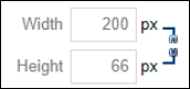
Note: Be sure that your width and height are constrained. This will ensure that if you change one value, the other value will automatically adjust so that the image ratio stays the same. So, for example, if the image is 800 pixels wide by 400 pixels high, if you change the width the 200 pixels, the height will automatically be set to 100 pixels. To switch between constrained and unconstrained, click on the chain image to the right of width/height.
Constrained

Unconstrained
-
CSS Class: Allows you to select a particular CSS class to apply to your image.
-
Best Fit : This option resizes the image to fit in the preview window.
-
Actual Size: Displays the actual size of the image.
-
Zoom In: Allows users to zoom in on the image.
-
Zoom Out: Allows users to zoom out on the image.
In addition to these elements, the Image Editor at the top of the right column offers a number of other options. These options will be detailed in the following section.
Editing an Image
You can easily resize and create thumbnails of images. To resize your image to thumbnail size or otherwise, simply select the image from the Image Manager and click Image Editor at the top of the right column. You can create a thumbnail image by manipulating the Width and Height fields in the Resize box and selecting to Save those changes. The resized image will be previewed in the left column as you adjust the Width and Height values.
You may also Flip or Rotate the image. If you Flip the image, you may choose Flip Horizontal, Flip Vertical, or Flip Both. If you Rotate the image, you can choose between 90°, 180°, or 270°.
If you wish to display only a portion of the image, you may also use Crop to choose a portion of the image to turn into a new file.
When you have finished making your changes, click Save to save your new image.
Editing Image Properties
Much like the Table Properties section covered earlier in this manual, the Image Properties allow you to edit various aspects of a specific picture once it has been inserted onto your site. To access image properties simply right click on the image and select Image Properties (we will cover the Image Map Editor later in this manual).
This will open a new window through which you can edit many of the same elements as under the Properties tab, which was available when you uploaded and inserted the image initially:
-
Border Width: You can specify the thickness of a border around the image. Leave this blank if you do not want a border around your image.
-
Border Color: Select the color of the image border.
-
Image Alt Text: Displays an alternative text for the image. This is used by screen readers. You must add alt text for your image to ensure the image is accessible.
-
Long description: You can optionally enter a link to a more detailed description of your image in this field.
-
Image Alignment: Specifies the alignment of the image on the page.
-
Margin: Specify space to the Top, Bottom, Right or Left of the image.
-
Width: Allows you to alter the width of the image.
-
Height: Allows you to alter the height of the image.
Note: Be sure that your width and height are constrained. This will ensure that if you change one value, the other value will automatically adjust so that the image ratio stays the same. So, for example, if the image is 800 pixels wide by 400 pixels high, if you change the width the 200 pixels, the height will automatically be set to 100 pixels. To switch between constrained and unconstrained, click on the chain image to the right of width/height.
Constrained
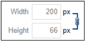
Unconstrained

-
CSS Class: Allows you to select a particular CSS class to apply to your image.
Image Map Editor
The Image Map Editor allows you to create multiple clickable areas on an image. You may create an image map by right clicking on the image and selecting Image Map Editor.
Here, you may select a rectangular or circular area to highlight the image. You can then adjust the dimensions of the selected area by dragging the corners of the area itself, or specifically defining dimensions under the Selected Area Properties heading. Finally, you must specify a URL to complete this step.
ClipArt Manager
The ClipArt Manager allows you to quickly and easily insert images from our ClipArt library on to your page. To insert a ClipArt image:
-
Click the area in the editor where you want to insert your image and then click the image icon.
-
A new window will open. From this window, you can click on a category you are interested in. You can also choose to view All Categories or just view Clip Art images you have Recently Selected.
-
If you wish, you can use the Search bar to search for a specific image. Just type in a keyword and click Find.
-
If you find an image you like, you can see a larger version of the image by hovering over the image and selecting Preview. If you wish to use the image, you can then click Select to choose the image.
-
If you do not wish to the image, click on the X in the top right corner of the image.
-
If you know you want to use a particular image, you can bypass the preview and insert the image directly. To do so, hover over the image and click on the image outside of the Preview button.
-
Once you insert an image, you can right-click on the image and choose Properties if you wish to change the image size or alter other image properties. For more on editing image properties, see Editing Image Properties earlier in this guide.
HTML Editing
For technical users the editor allows you to work with the HTML of your content directly. Simply click on the <>HTML to display the HTML code for the portlet.