
The Workflow Engine allows you to design, automate, and efficiently manage processes at the school or district level.
At each stage in the workflow, one individual or group is responsible for a specific task. Once the task is complete, the workflow system ensures that the individuals responsible for the next task are notified, and that they receive the data they need to execute their stage of the process. The Workflow application also automates redundant tasks and ensures uncompleted tasks are easily followed up on.
The workflow application also supports the charting of workflow process with the subsequent routing of data, online forms, and other documents to the appropriate users designated in the workflow. It features robust functionality which can support complex workflow processes.
Accessing Workflow
The workflow can be accessed by adding /workflow to the end of your website’s URL. For ease of use, you may wish to add the Workflow link elsewhere (for example, in a Quick Links box or via the Published Links).
Adding a Workflow
Adding a workflow to your site is simple. Start by choosing Workflow from the Add New Item drop-down menu. Then fill out the fields and click Create.
Analyzing a Sample Workflow
In this section, we will look at a sample workflow and go over what each of the components is being used for and why. Each time a new type of task is used, we will take an in-depth look at what each option can do. Thus, by the end of this section, you should have an understanding of how many of the most commonly used workflow tasks function.
If you have never used the workflow designer before, you may wish to use these instructions to follow along and create your own sample workflow.
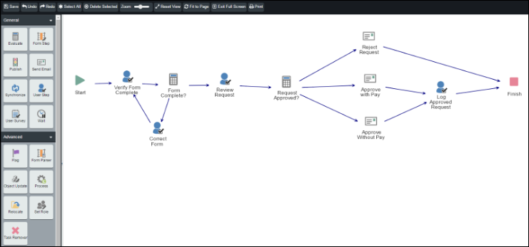
This particular workflow is started when a user fills out a form requesting time off. Once the form is completed, the workflow begins with the Start object.
To simplify matters, we will break the workflow in to two sections.
In section 1, an HR assistant will verify the staff member completed the form correctly. If the form has been completed correctly, it is then sent to the HR manager for review and approval. If the form is incomplete in some way, then the user will be asked to correct the form.
-
The first step, when creating a new workflow, is to actually add a new workflow from within the Workflow root. We covered how to do this in the previous section. In this case, our new workflow will be called Vacation Approval.
-
Before we start building the workflow, we want to set up the necessary roles. As we described our workflow, we have three roles: the staff member that fills out the request, the person that confirms the form has been completed properly and the person that reviews and approves the request.
-
The staff member that fills out the form that kicks off the workflow will be the Initiator. The Initiator role is part of every workflow so we do not need to create that role. The other two roles will need to be created.
-
To create a new role, click on the Roles tab. For each role you wish to add, type in the name of your new role in the Add Role box and click Add Role. We will add a role for HR Assistant and a role for HR Manager.
-
Once you have added the roles, click the + beside each name and use the Add button to open the user picker. This allows you to select and add a user (or users) to each role. We will add charlie.danner to the HR Assistant role and bert.tate to the HR Manager role.
-
Now click back to the Design tab to begin building the workflow steps.
-
Verify that the form was completed successfully. To do this, we will need a User Step. This is a workflow task that allows you to provide the user with instructions on what to do and then provide one or more options they can click to indicate the task has been completed.
-
To add a task, click and drag the icon for the task you want from the bar on the left and drop it into the design area. In this case, click and drag a User Step and place it in the design area.
-
After placing the User Step, double-click the icon to bring up the configuration settings for that step. Before opening the User Step Properties, you will be prompted to save the change to your workflow. You will be asked to do this when you add new tasks, add new lines, or change the position of a task within the designer.
-
For the Step Name, enter Verify Form Complete and include Instructions for the user.
-
Click the Assignee drop-down and choose the appropriate role. Our HR Assistant, Charlie Danner, will be responsible for verifying the form has been completed so set the Assignee to HR Assistant.
-
For Group Options, there is only one user in the HR Assistant role, so all of the options will behave the same way; thus leave it set to the default option, Any.
-
For Duration we will set the amount of time we expect from when the task is assigned to when it will be completed. It’s a simple task, so set the duration to 1 Day(s).
-
When the HR Assistant reviews the form, they have a decision to make. They will need to confirm that the form is complete or that the form is not complete. In the Decisions box, add one decision option for Form is Complete and one for Form is Not Complete.
-
None of the Allow Users To options are required so we will not check those options.
-
We want to be sure that the HR Assistant, Charlie Danner, knows when there is a new request to review so leave the Notify Assignees option set to Yes so that Charlie will be emailed whenever this task is triggered.
-
Once you have finished configuring the user step, click Submit to save our changes.
Because the Verify Form Complete user step contained more than one decision we will use an Evaluate task to determine which route the workflow case will follow. Click and drag the Evaluate task in to the design area. Before we define the Evaluate task however, it will actually be easier for us to first add the two possible follow-up tasks that will be used, depending on the decision outcome.
One option is that the form has been completed successfully; the other option is that the form has not been completed successfully. As such, we need to add two more User Steps, one that will allow the submitter to correct their submission and the other that will allow the HR manager to review the request. To do so, click and drag two additional User Steps into the design area.
As we have added a few steps in now, we should connect the arrows to indicate the path that the workflow should take for each case. Hover your mouse over the white box at the center of the Start button. When your cursor is in the correct location, the cursor will change to a crosshair. Click and drag from the white box within Start to Verify Form Complete. Use the same process to join the other tasks.
Be sure to create your lines in the order you want the workflow to go (so from Start to Verify Form Complete and not from Verify Form Complete to Start). The direction of the arrow for each line determines the order the tasks are completed.
-
After the lines are connected, double-click on the bottom User Step; this step is intended to allow the user that submitted the request have an opportunity to correct their submission as requested by the HR Assistant.
-
Enter Correct Form for the Step Name, and include Instructions for the user.
-
The person who first submitted the form will be responsible for correcting the form so leave the Assignee field set to Initiator. Once again there is only one person being assigned the task, so leave the Group Options set to any.
-
The user is likely going to be anxious to correct their request submission, so set the expected Duration to 1 Day(s).
-
For the Decisions box, in this case, we are only looking for confirmation once the user has corrected their form. So enter one decision, Form has been Corrected.
-
Once again, leave the Allow Users To boxes unchecked.
-
And, as we want the user to know about their missing form data as soon as possible, leave Notify Assignees set to Yes.
-
Once we have finished configuring the step, we click Submit.
-
We have now a loop in our workflow as once this task has been completed, the User Step, Verify Form Complete will once again be assigned to the HR Assistant. This process will continue until the HR Assistant has confirmed the form has been completed correctly.
-
The loop will not actually run until after we set up our Evaluate task. Before we do that though, let us set up our other User Step, the one for the HR Manager to review the completed form.
-
Double-click on the User Step to the right of the Evaluate task.
-
For the Step Name, use Review Request, and include Instructions for the user.
-
Our HR manager, Bert Tate, will be responsible for reviewing our vacation requests and deciding whether or not to approve the requests. So choose HR Manager for the Assignee drop-down.
-
Once again there is only one person being assigned the task, so leave the Group Options set to any.
-
For the duration, our hypothetical HR Manager often takes some time to evaluate requests so set the Duration to 3 Day(s).
-
There are three possible decisions available to the HR manager. They can approve the request with pay, approve the request without pay or deny the request. Provide three Decisions, one for each of the options.
-
Once again, leave the Allow Users To boxes unchecked.
-
And, as we want the HR Manager to know about the request immediately, leave Notify Assignees set to Yes. In the event that the HR Manager was regular checking for pending tasks on a daily basis, we might set this option to No.
-
Once we have finished configuring the step, click Submit.
-
Now that we have set up both of the follow-up tasks, we can now set up the Evaluate task. To do so, double-click on the Evaluate task.
-
For the Name of the task use Form Complete?
-
Click Add Rule….
-
Leave the first drop-down set to Decision of.
-
For the second drop-down, choose Verify Form Complete. This is the task we want to look at before deciding where our workflow should go next.
-
For the third drop-down, leave it set to Was.
-
For the fourth drop-down, choose Form is Complete. On the box to the right of the fourth drop-down, choose the user step that goes with Form is Complete. If the form is okay, we then want the HR Manager to look at it, so choose Review Request.
-
Now click Add Rule… again.
-
This time use the drop-downs to set Decision of Verify Form Complete was Form is Not Complete. If the form is not complete, we then want to go to the Correct Form user step. As there are only two options, and we have explicitly defined what to do in either scenario, leave the Otherwise option without specifying a follow-up task.
-
Once you are done with your configuration settings, click Submit.
We have now completed the configuration for the first half of our workflow. The user fills out a form requesting time off and the HR Assistant verifies it is complete. If it is not, the initiating user is asked to correct the form. Once the form has been verified as complete, it is then assigned to the HR Manager to approve or deny the request.
In section two, we consider the same Review Request user step that we set up as part of section 1.
In section two, the workflow will look at what decision the HR Manager made in the Review Request user step. The workflow will then email the user to let them know their request was rejected, approved without pay or approved with pay. If the request was approved a new task is then assigned to the HR Assistant to log the approved request. The workflow will then terminate.
To begin setting up this section:
Drag and drop an Evaluate task onto the design area.
-
Then do the same thing with the Send Email task three times.
-
Now draw an arrow from Review Request to Evaluate. Then draw arrows from Evaluate to each of the Send Email tasks.
-
Once you have the arrows in place, double-click on the top Send Email task.
-
We will use the first Send Email task to handle the cases where the vacation request has been rejected.
-
For the Task Name, type in Reject Request.
-
The context of the email will be sufficient so we can leave the Description field blank.
-
Leave the Language set to English.
-
For the Send To field we want this email to go to the user that initially submitted the form. Click on the Workflow Roles radio button and choose Initiator.
-
As we do not need anyone else to have a copy of the email, leave the CC and BCC fields empty.
-
For the Subject field, fill out a relevant subject.
-
For the Body field, include information about the request rejection. You can use the Custom Email Tags drop-down to greet the Initiator by name.
-
We want the email to go out right away, so leave the Wait Duration set to 0 minutes.
-
Because there may be a variety of reasons why the vacation request was rejected, choose that this task Requires User Input. By setting this value to Yes we can then determine who is assigned this task. In this case, set the Assignee drop-down to HR Manager. In some cases, the HR Manager may want to send the email to the user’s manager, or the HR assistant as well as sending it to the initial submitter, so check the box to Allow Users To Change Email Address.
-
Once you have configured the email settings, click Submit.
-
Now double-click on the second Send Email task you have added.
-
This Send Email task will be used to email those users that have their request approved with pay.
-
For the Task Name, enter Approve with Pay.
-
The context of the email will be sufficient so leave the Description field blank.
-
Leave the Language set to English.
-
For the Send To field we want this email to go to the user that initially submitted the form. Click on the Workflow Roles radio button and choose Initiator.
-
We also want this email to be sent to the HR Assistant as they will be logging the request. For the CC field, click on the Workflow Roles radio button and then click on the HR Assistant role. Leave the BCC field blank.
-
For the Subject field, fill out a relevant subject.
-
For the Body field, include the information about the request approval. You can use the Custom Email Tags drop-down to greet the Initiator by name.
-
We want the email to go out right away, so leave the Wait Duration set to 0 minutes.
-
In this case, we do not need to add any additional details to the email, so set the Requires User Input field to No. In the event, we wanted to be able to customize the approval email each time it was sent, you could change the setting to Yes.
-
Once you have finished configuring the email settings, click Submit to save your changes.
-
Now double-click on the third Send Email task.
-
This last Send Email task will be used to email those users that have their requests approved without pay.
-
In this case, we will use all the same settings as in the previous Send Email task. The only differences will be in the Task Name, Subject and Body. Those will be changed to indicate the vacation request has been approved without pay.
-
Now that we have set up all three follow tasks, we will now set up the Evaluate task. Double-click on the Evaluate task.
-
Fill out the Name field with Request Approved?
-
Click the Add Rule… link. We will first set up the rule for denying the vacation request.
-
Leave the first drop-down field leave the drop-down set to Decision of.
-
For the second drop-down, choose Review Request.
-
For the third field, leave the drop-down set to was.
-
For the fourth field, set the drop-down to Deny Request. Then click on Reject Request on the box to the right to link the choice.
-
For the next two rules, click Add Rule… and make the following choices:
-
Decision of Review Request was Approve Request with Pay -> Approve with Pay
-
Decision of Review Request was Approve Request without Pay -> Approve without Pay
-
We have covered all possible choices, so you can leave the Otherwise option unselected.
-
-
-
Once you have set up all your rules, click Submit to save the changes.
We now have three possible paths, one for the vacation request being rejected, and two for the vacation request being approved. We now have to determine the next step for each of these three paths.
-
In the case of the rejected request, there is no further action required so draw a line from Reject Request to Finish. We have now concluded the path that is taken for a rejected vacation request and no further action will be required for that scenario.
-
For the remaining two choices, Approve with Pay and Approve without Pay, we want our HR assistant to log the request. Create a user step to assign that task to the HR assistant.
-
Click and drag a User Step in to the design area. Once you have added the step, double-click it.
-
For the Step Name, fill in Log Approved Request.
-
For the Instructions field, add instructions for the HR assistant to log the approved vacation request.
-
For the Assignee field, choose HR Assistant.
-
For Group Options, there is only one assignee, so leave the setting on the default any option.
-
For the Duration field, there is not a large degree of urgency to the request being logged so set a longer duration of 5 Days.
-
For the Allow Users To checkboxes, we do not need any of these options so leave them unchecked.
-
We want the HR Assistant to be emailed about this task, so set Notify Assignees to Yes.
-
Once you have finished configuring the step, click Submit.
-
As we want the request to be logged whether the request is approved with or without pay, draw lines from Approve with Pay and Approve without Pay to Log Approved Request.
-
Then draw a line from Log Approved Request to Finish.
-
The workflow design is now complete so click Save to save your changes.
Now that the workflow is complete, we can now use forms to initiate the workflow. For information on how to link forms to workflows, please see Using a Form to Initiate a Workflow.
After creating a new workflow, it is always a good idea to run a few test cases to make sure everything is configured properly and you haven’t forgotten any steps along the way. You can start a new case from the Cases tab or by filling out a form portlet that has been set to route to the workflow.
Administration
Once you are on the Newsletter page, click on the Administration link.
On the Administration page, you will see four options:
-
Manage Newsletters
-
Manage Subscribers
-
Manage Security
-
Manage Settings
Manage Newsletters
The Manage Newsletters section allows you to perform various changes on your newsletter's profile.
Adding a Newsletter
To create a newsletter, click Add Newsletter.
Clicking on this link will lead you to a page containing Presence’s Content Editor. Here, you may Name and insert a Description of your newsletter.
When completed, click on Add New. Click Cancel to discard changes.
Editing a Newsletter
When you select a newsletter in the Manage Newsletters section, you will be directed to a page displaying newsletter settings.
This page features the tabs below:
-
Messages
-
Settings
-
Subscribers
-
Security
To edit a newsletter:
-
Select the desired newsletter.
-
Click on the Settings tab.
-
Here you may change the Title or Description of the newsletter.
-
Once you have made the desired changes, you may click the Update. To remove changes, click Cancel.
Deleting a Newsletter
If you wish to delete a newsletter, click on the X icon in the Action column to delete the corresponding newsletter.
Searching for a Newsletter
On the Newsletter page, you will see blank search bar next to a field named Find Newsletters. Here you may enter keywords that correspond to the title or the content of the newsletter you are looking for. You can search by Name, Description or Both.
Click Search to execute your personalized search. To see all newsletters, click View All.
Messages
When you select a newsletter, you will be directed to a page displaying newsletter settings. Selecting the Messages tab will bring you to a page displaying draft and past messages. You can also create new messages here.
The Draft Messages section contains messages that have not been published. This could be either because they have been saved but not scheduled for release, or because they have been scheduled for a later date or time. Unscheduled saved messages are marked as Draft under the Status column, whereas messages that have a scheduled send time are marked as Scheduled.
The Past Messages section contains messages that have already been published. Columns titled Publish Time and Action give the exact publishing time, and an option to copy the message respectively.
The Archive Messages section contains messages that have previously been published but are no longer visible to users viewing the newsletter page.
You may add, delete, copy, or edit a message.
Adding a Message
-
Click Add Message to bring up Presence's content editor. Here you may draft a new message.
-
Embedded in the newsletter module is a visually driven tracking system that allows authors to systematically view the steps pertaining to the publications of the newsletters.
-
Title: Fill in the title of your message.
-
HTML Content: Fill in your content of your message which you want readers to see.
-
Convert Content to Plain Text: This option takes the HTML content and then converts it to plain text in the box below where you can make changes if needed.
-
-
Once you have filled out the information, click Next. If you want to work on your message later click Save As Draft. If you have clicked Next you will now be shown a preview of your message as it will appear to viewers.
-
If you are not satisfied with the newsletter, you may hit the Back button to edit or the Cancel button to cancel sending the message and return to the Messages screen. Selecting Back will redirect you to the previous page where you can modify the content and title of your message. Selecting Cancel will redirect you to the main Messages tab and list your message as Draft under the Status column.
-
If you are happy with your message, click Next to proceed. This will bring you to a scheduling page where you can choose the date and time for the message to be sent.
-
-
If you would like to release this message immediately, choose Send immediately. Otherwise, choose Send at the Following Time and fill in the required fields.
-
Click Next to view the Message Publishing Summary. This will give you a preview of the message, the timing of release (if scheduled for a later date and time) and the number of subscribers who will receive the message.
-
To deliver the message, click Finish.
The message will then appear in the Draft Messages section until it is sent out. Once it has been sent it will appear in the Past Messages section.
Note: If you choose to send the message immediately, the message will be sent within one hour of submission. The delivery time varies based on the size of the message and the number of subscribers.
Deleting a Message
A message in the Draft Messages section can be deleted by clicking the X icon that appears in the Action column.
A window will pop up asking you to click OK to confirm you wish to delete the message or Cancel to keep it.
Copying a Message
A message in the Past Messages section can be copied by clicking on the copy icon under the Action column.
When you click on the icon, the content editor will load. The content is duplicated from the message you want to copy.
Editing a Message
You can edit a message in the Draft Messages section by clicking on the Name of the message and making the desired changes.
Subscribers
The third tab under the Manage Newsletters section is Subscribers. On the Subscribers tab you may add, reject, delete or find subscribers. You may view the subscription status of subscribers under this tab.
Adding a Subscriber
To add a subscriber, click Add Subscriber.
You may add users from your site by selecting the user group icon. External users may be added by entering their email addresses into the New Subscribers field.
These e-mails will automatically be approved.
Rejecting a Subscriber
If you want to reject a subscription, you may click on the red dot icon that appears under the Actions column on the Subscribers page.
Deleting a Subscriber
Under the Actions column, click the X to delete a subscriber. A window will pop up for you to confirm that you want to delete this subscriber.
Finding a Subscriber
You will notice a blank search bar next to a field named Find Subscribers.
Here, you may enter keywords that correspond to the subscriber’s email address. Once you have inserted the keyword(s), click the Search button. If at any point, you wish to view all the email messages in the database, click the View All button located next to the Search button. Clicking Subscribers will sort the email addresses alphabetically. Each additional click will reverse the order that newsletter names are sorted. You may similarly sort by Joining Date or subscription Status.
View Subscription Status
Under this column, each subscriber falls under one of the following categories: Unsubscribed, Unapproved, Approved, or Rejected.
-
Unsubscribed refers to a subscriber who does not wish to continue subscribing to a specific newsletter.
-
Unapproved is used for users that have chosen to subscribe but have not yet verified their email address.
-
Approved refers to a subscriber who has been successfully added to the list of subscribers.
-
Rejected refers to a subscriber that has been declined subscription status.
Security
In the Security tab on a newsletter, you can grant users permissions on the newsletter. By default, they will inherit the permissions from the root newsletter security, however you also can assign permissions at the individual newsletter level.
The Roles tab allows users and groups to be added to pre-defined security roles. Form Template Root Administrators have full access to access, create, edit, and delete any form categories, form templates, their revisions, and their submissions. Only users in this role can access and use the Manage Form Categories interface.
Form Template Root Authors have the ability to edit all the form templates, as well as create new form templates. Users in the Authors role are unable to view submissions or configure security to a form template unless they are the creator of that form template. Authors do not see the Manage Form Categories link from the Form Library.
Users and groups in the Form Template Root Browsers role are able to access the Form Library to be able to fill out forms. Browsers do not see the Manage Form Templates and Manage Form Categories links from the Form Library.
To assign a user or group to a role, click the plus icon next the role name to expand the list of users in that role.
Click Add to open the user picker window. From this window select the users or groups you’d like to grant permissions to by clicking their name and clicking Add. When you have selected your users, click OK.
Direct Permissions
Within Direct Permissions you can assign specific forms security permissions to other users and groups.
First, click Add to select the users to grant permissions to. A window will pop up.
From this window select the users or groups you’d like to grant permissions to by clicking their name and clicking Add. When you have selected your users, click OK.
To individually assign permissions to each user, click on the plus icon beside their name. From here you can assign specific permissions.
|
Permission |
What it Allows you to do |
|
Create |
Can create and send messages but only if paired with Write permissions. Can also copy an existing message. |
|
Delete |
Can delete archived messages but only if paired with Write permissions. |
|
Read |
Can view and subscribe to the newsletter. |
|
Write |
Can update the name and description of the newsletter. |
|
Full Control |
All of the above, as well as the ability to archive past messages. Can also manage Subscribers and configure Security on the newsletter |
Accessing the Knowledge Repository
You can access your Knowledge Repository by adding /kr at the end of your site (ie. http://www.yourdomain.com/kr). You may also access this area by having it be part of your published links or by adding a link on a page.
Managing the Knowledge Repository
Adding a Domain
To begin you need to add a domain. A domain in the Knowledge Repository is considered to be the top level of the section you are about to populate with content.
To add a domain:
-
Log in as an administrator
-
Go to System Administration and then under the Knowledge Repository section click on Manage Domains.
-
Click Add Domain.
-
Fill in the Name of your domain. You can add a Description if you wish.
-
Click Create Domain.
Managing a Domain
By clicking on a specific domain from within Manage Domains or on /KR, you can perform a number of actions such as adding categories, editing categories, changing security settings, editing domain settings and deleting the domain.
Adding a Knowledge Category
All the resources within the KR must be stored within the Knowledge Categories.
-
To create a knowledge category, click Add Knowledge Category from the Domain Administration menu.
-
Fill in the Name of your category. You can add a Description if you wish.
-
Click Add Category to create the category.
Security
Direct Permissions
The Direct Permissions tab lists all the users that are given direct capability of modifying this domain.
-
You can add users to the list by clicking Add.
-
A window called Select Groups and Users will appear. Here, you can select the groups/users that you wish to add and then click Add. If you’ve accidentally added someone, you can remove them by selecting them from the bottom list and clicking Remove.
-
When you are done, click OK.
To remove direct permissions from a user:
Select the box next to the user’s name and then click Remove. Click on the + beside a user, to alter the privileges that user has.
You also have the option to allow inheritable permissions from parents of this object to propagate to it by checking the box at the bottom and clicking Apply. The same goes for resetting permissions on all child objects and enabling propagation of inheritable permissions.
Actual Permissions
Actual Permissions refer to users that have the privilege of modifying this domain, but the permission may be inherited. That is they might have permissions through inheriting from parent object permissions. At the top of this section is a search field to help you look for specific users or groups. If you click the + sign beside a user, you can see exactly what privileges that user possesses for the domain.
Editing a Domain
This page is used to edit the name and description of the domain. You can change the name using the Name text field, or change the description using the Description text area. Once all changes are made, click on the Update Domain button to finalize the change.
Deleting a Domain
To delete a domain, click Delete Domain. Once the link is clicked, a warning message will appear asking you to confirm the action. If you click OK the entire domain along with all of its categories, sub-categories and any resources that are not linked to multiple domains will be permanently deleted from the system.
Managing Categories
If you click on a category within a domain, you can access all the resources and links in a category just by clicking on them. There are also sorting options on top of the list of resources. Sort By Date lists the items from the most recently created to the least recently created. Sort Alphabetically lists the items from A to Z. Sort By Rating lists the items from the highest to the lowest rating.
To access any created categories, click on the name of the category.
On the left-hand side of the page, the first section is called Contribute which includes the Add Resource and Add Link options. The Categories section is a list of links to all the sub-categories of this category. And the Administration section contains the tools that you can use to edit the category.
Adding a Resource
It is simple to add a new resource. Click Add Resource from the left-hand side under Contribute. Each resource can be a file of any type, or a link.
You can add a single file or multiple files at the same time. To add a single file, click on Browse to select the file from your computer, change the File Name if necessary, fill in an optional Description and then click Add Resource.
Adding a New Link
To create a new link, click Add Link. Enter in a Link Name and a Web Address (URL). If you wish you can also add a Description of the link.
Adding Sub-Categories
To create a sub-category of the current category, click Add Category from the Administration menu.
Fill in the Name of your category. You can add a Description if you wish.
Managing Resources
You are able to edit, remove, and purge items in a category by clicking on Manage Resources. To manage a specific resource, click the Edit button beside it. You are able to edit their name, description, and URL or file path.
By placing a check beside a resource, you can choose to remove it from this category by clicking on the Remove button at the bottom, or you can delete it from the system by clicking on the Purge button.
Note: If the resource is only part of a single category, removing the resource will permanently delete the item just like when you purge a resource.
Editing a Category
By clicking Edit Category you can make changes to the Name and Description fields.
If you make any changes, click Update Category button to finalize the change.
Deleting a Category
Once the Delete Category link is clicked, a warning message will appear asking you to confirm the action. If you click OK, the entire category along with all of its sub-categories will be deleted.
Working with Resources
If you click on a resource within a category, you will be able to edit and update the resource, configure metadata and categories and determine security settings.
Viewing a Resource
The View Resource tab shows all the information about the resource. The file details section includes the file name, the user that last modified the file, the date the file was last modified, the file size, and user ratings are displayed. Also, if there are any other files linked to this resource, they will be listed here.
If you have yet to rate this resource, you can do so using the radio buttons below the resource information. The Metadata attributes section, displays any information that has been added on the Metadata tab.
The Comment section allows users to add their own comments via the Add Comment link, reply to someone else’s comment using the Reply link, edit a comment through Edit, and delete a comment by clicking Delete.
Rating a Resource
The Knowledge Repository also supports the concept of rating your resources. Users can rate resources to capture the community’s impression of this resource. Users who have not rated a resource will see something like in the View a Resource tab. The average rating will be display on the category page next to the file as seen below.
Editing a Resource
If you click on the Edit Resource tab, you can update the Name or Description field of the resource.
If you make any changes, click Update File to confirm.
Categories
In the Categories tab, you can choose which category or categories the resource belongs to.
-
To add a category, use the Category Browser section.
-
First, click on the Browse button and a new window should appear.
-
Use that window to search through the Knowledge Repository and click Select on the category you wish to add.
-
Click Add to add the resource to the selected category.
-
In the Categories section, a list of all the categories that are linked to this resource is displayed.
Here, you can also delete any existing categories by clicking on X under Action.
Linked Resources
In the Linked Resources tab, you can add files that are related to the resource and the will be shown in the View Resources tab. To link a file, use the Browse button and find the file, give the file a Name and optionally added a Description.
Click the Add Resource button to upload the file.
On the bottom this page, there is a section called Linked Resources. This is a list of all the files that are currently linked to the resource. Here you can sort the list of files by Name, Date Modified, User, and File Size by clicking on their respective links in the first row. You can also delete files by checking on the checkboxes of the files that you want to delete, and then use the Actions drop-down menu and click Delete Selected.
All Versions
The All Versions tab is used to store multiple versions of the resource so that it can be conveniently changed at any time. Under the All Revisions section is a list of all the versions of the resource.
You can access the files of each resource by clicking on their file names. You can also choose which version is the live version by clicking on the Make Live link. The live version is the one that all the users see. To add new versions, click on the Add New Revision link that is on the top right-hand corner of the section. To delete a version, click on the Delete link.
The All Versions tab also has a comment section much like the View Resources tab.
Metadata
When working with a resource, users can update the Metadata tab for the resource. This information will be visible to users viewing the resource.
Simply fill out the fields and click Update to save your changes.
Security
You can configure permissions on an individual resource by clicking on the Security tab.
Direct Permissions
The Direct Permissions tab lists all the users that are given direct capability of modifying this resource.
You can add users to the list by clicking on Add, and a new window called Select Groups and Users will appear. Here, you can select the groups/users that you wish to add and then click on Add. If you’ve accidentally added someone, you can remove them by selecting them from the bottom list and clicking Remove. When you are done, click OK. To remove direct permissions from a user, check the box next to the user’s name and then click Remove. If you click on the + beside a user, you can alter the privileges that user has.
You also have the option to allow inheritable permissions from parents of this object to propagate to it by checking the box at the bottom and clicking Apply. The same goes for resetting permissions on all child objects and enabling propagation of inheritable permissions.
Actual Permissions
Actual Permissions refer to users that have the privilege of modifying this resource, but the permission may be inherited. That is they might have permissions through inheriting from parent object permissions. At the top of this section is a search field to help you look for specific users or groups. If you click the + beside a user, you can see exactly what privileges that user possesses for the resource.
Form Building Basics
There are two components to the Form system – the Form Template and the Form Instance – and it is important to understand the distinction between the two.
About Form Templates
Form Templates are templates that are used as a standardized form from which individual form instances can be generated. They can also be copied and changed to create other new form templates. The form template acts as a master copy of the form and individual submissions are copies of the template. Any changes made to the form template will result in a change to all future submissions for that form.
About Form Instances
Form Instances are submitted copies of the form template that include the submission information. Changes to form instances can only be made in the submitted information field.
Accessing the Form Library
The Form Library can be accessed by adding the /form extension to your website domain URL, in the address bar. For example, if your domain is www.yourdomainhere.com, then the URL to access the Form Library would be www.yourdomainhere.com/form
From the Form Library, users can search among the forms available and are able to click Fill Out Form to fill out any of the forms they have access to fill out.
Managing Form Templates
Adding a Form Template
-
At the form library, click Manage Form Templates. This brings you to a list of all the Form Templates in the current category. Clicking on Add Form Template will open up the Rich Text editor where you can design and create your custom online form.
-
Enter a Name for your form. This will be the display name for your form. On sites with multiple language support, Locale is used to describe the language of the form.
-
To add the template to one or more categories, click the folder icon to the right of the Category field. A list of categories and subcategories will appear.
The Template Content area is the body of your form. The Rich Text editor grants you the ability and freedom to design the form as you choose. You may design and customize the form to your specifications.
In addition to the normal formatting functions available in the Rich Text editor, additional form-only features are included in the editor.
|
ICON |
DEFINITION |
FUNCTION |
|
|
Checkbox |
Inserts a checkbox. |
|
|
Radio Button |
Makes a button for selecting a single option among a group of options. |
|
|
Text Field |
Creates a field for text input. |
|
|
Text Area |
Makes a field for text input with multiple rows. |
|
|
Selection Field |
Creates a drop-down menu box. |
|
|
Hidden Field |
A hidden field the user cannot see. |
The next section will go into more detail on how to set up each of these individual form input components.
The On Submission area gives options that allow you to control how the form submissions are saved.
-
Save data to default location will save the form submissions in the Form Builder along with the template.
-
Do Not Save Data can only be selected if the Email Notifications are enabled; there will not be any online record of the submission if this option is selected.
-
Save data to specified folder will save each Form Submission as an entry in a folder in the Workspaces or eLearning Server.
-
Save and attach to specified Workflow connects the form submission to a workflow which can be used to trigger a series of tasks.
You can use the Auto-Email field to send an automated email response to the user after they fill out the form. Select the Email Field where the user enters their email address, fill out the Email Body and, if you wish, specify that the user will also be sent a copy of their submission (via the Include form data option).
If you want guest users to have to fill out a CAPTCHA, check Enable security measure on Guest users. This can help prevent spam-bots from sending in automated submissions to your form.
The After Submission area allows the author of the form template to specify what a user sees after the form has been submitted. If the form was filled out from the /form area then by default, after filling out the form, the user will be taken back to the /form area. If the form was added to a page via a Form Portlet, then, by default, the page will reload after the user submits the form.
-
The user can be redirected to a specific URL once the form has been filled out. Show Specified Message will display a custom message after the form is submitted before returning the user to the default location.
-
You can select Send email notification to specified users or addresses to send an email with the form contents each time the form is submitted. To add users already on the site, click on user group icon to open the user picker. When the pop-up window appears, select the groups and site users to be emailed on form submission and click Add. Once all the users to be contacted have been added to the list at the bottom half of the user picker, select OK.
-
To add e-mail addresses not associated with user accounts on the site, enter them into the Email Addresses field. If there are multiple addresses, they should be separated by a semi-colon (;). In email notifications, the Title field appears as the subject line of the notification message.
-
Once the information has been filled out, click the Validation Check button to ensure that all the input fields have been configured correctly. If any fields require additional configuration, a message will be displayed above the Rich Text editor area, detailing the necessary changes. Complete the configurations and click the Validation Check button again. When the Successful indication text appears, click the Next button.
-
Check off any fields you wish to be mandatory. A form cannot be submitted unless the mandatory fields are populated. You can also enter in a customized Error Message to display when the Mandatory fields are missing on submission.
-
Click Publish Form Template to create the new form template. This will create the first version of your form template. To continue editing the form template before publishing, click Back to return to the editor page.
Editing a Form Template
Click the name of the custom form you wish to edit in the Manage Form Templates interface. This opens up the View page.
Click the Edit tab to access the Rich Text Editor. Editing the form allows you to rename your form, change or add input fields, as well as reorganize the layout of the form.
Apply any desired changes to your form template. Click on the Next button to proceed.
Apply any changes to the Mandatory checkboxes or Error Message fields. Click the Publish Form Template button to publish the changes.
Note: The Save As Draft button can be used to save any changes you’ve made without creating a new version of the form. This feature when you want to make additional changes to the form are required before publishing the new version.
Configuring Form Template Input Fields
The most important elements in designing a custom online form are the input fields. These are the areas that will take a user’s input on submission. Depending on the type of input field, the configuration may differ slightly.
Checkbox Field
The checkbox field puts a checkbox on your custom online form. The checkbox can be either Selected or Not Selected, and the Value of the checkbox is displayed when it is submitted as Selected.
When the Checkbox button is selected in the editor, a pop-up window appears that prompts for these values:
-
Name: The display name of the input field as it would appear in submission reports. The Name field is not case-sensitive and should not include any special characters or spaces. Underscores “_” are accepted.
-
Value: The display value in submission reports when the checkbox is Selected.
-
Selected: Sets whether the checkbox is Selected by default.
It is also possible to access the checkbox properties window by right-clicking on the checkbox and selecting Checkbox Properties.
Enter the Name and Value for your checkbox. You can also specify if you want the checkbox to be selected by default by checking the Selected checkbox. Click OK.
Radio Button
Radio buttons can be set up to allow users to select one option from a list of choices. Radio buttons are similar to checkboxes but are generally not used as standalone input fields. Radio buttons are great for multiple-choice questions where the user selects one option.
When the Radio Button icon is selected in the editor, a pop-up window appears that prompts for these values:
-
Name: The display name of the input field as it would appear in submission reports. The Name field is not case-sensitive and should not include any special characters or spaces. Underscores are allowed however.
-
Value: The display value in submission reports when the radio button is Selected.
-
Selected: Sets whether the radio button is Selected by default.
You can also access the radio button properties window by right-clicking on the radio button and clicking Radio Button Properties.
Enter the Name and Value for your radio button. You can also specify if you want the radio button to be selected by default by checking the Selected checkbox. Click OK.
To group a set of radio buttons so that users can only select one of the choices in a group, the Name of each of those radio buttons must be exactly the same. The Value field will indicate which of the options was selected.
Text Field
A text field can take any input and store that submission. Text fields offer a single line of input and can be configured to allow a set number of characters or be without limit.
When the Text Field button is selected in the editor, a pop-up window appears that prompts for these values:
-
Name: The display name of the input field as it would appear in submission reports. The Name field is not case-sensitive and should not include any special characters or spaces. Underscores “_” are accepted.
-
Value: The default value to display in the text field. Setting a default value is optional.
-
Character Width: The display width of the text field, in character spaces.
-
Maximum Characters: The maximum number of characters to allow on input.
-
Type: Choose the sort of data that will be entered in the field.
It is also possible to access the text field properties window by right-clicking on the text field and selecting Text Field Properties.
Enter the Name and Value for your text field. You can also define the Character Width and Maximum
Characters for the text field – if you do not specify values for these fields, they will be set to their default values.
Select the Type of input and click OK.
Text Area
The text area input field is an extension of the text field and allows for a large block of content instead of limiting input to a single line. You can configure the size of the text area to be as large or as little you like.
When the Text Area button is selected in the editor, a pop-up window appears that prompts for these values:
-
Name: The display name of the input field as it would appear in submission reports. The Name field is not case-sensitive and should not include any special characters or spaces. Underscores “_” are accepted.
-
Columns: The width of the text area to display, measured in character spaces.
-
Rows: The number of rows of the text area to display.
-
Value: The default value to display in the text area. This is optional.
It is also possible to access the text field properties window by right-clicking on the text field and selecting Text Area Properties.
Enter the Name of your text area. You can also define the number of Columns and Rows and set a default Value. If you do not specify values for these fields, they will be set to their default values. Click OK.
Selection Field
The selection field can be configured as a drop-down menu, a single item selection box, or a multiple item selection box.
When you click the Selection Field button, the selection field properties window pops up.
-
Name: The display name of the input field.
-
Size: The number of lines to display. To generate a dropdown menu, set Size to 0 or 1. Larger values will instead generate a selection box.
-
Allow multiple selections: Check this to allow more than one item to be selected. Allow multiple selections will only work for selection field Sizes greater than 1.
-
Text: The display text for the list items.
-
Value: The value stored when corresponding text is selected.
-
Add: Includes Text and Value item into the list.
-
Modify: Replaces the selected item in the list with the current Text and Value fields.
-
Up: Moves the selected item up the list.
-
Down: Moves the selected item down the list.
-
Set as selected value: Sets selected item as the default selection.
-
Delete: Removes selected item from the list.
It is also possible to access the selection field properties window by right-clicking on the text field and selecting Selection Field Properties.
Enter the Name of the selection field and specify the Size. Determine if you want to Allow multiple selections.
Enter items in the list by providing a display name in the Text field, and the corresponding Value. The order of the items in the list can be rearranged by using the Up and Down buttons.
Set the default value to be displayed in the selection field by clicking the Set as selected value button with the desired item selected. Click OK.
Hidden Field
With a hidden field, you can include a value with the form that is not visible to the user. This can be useful if you have multiple similar forms that are being processed by the same workflow.
When you click the Hidden Field button, the hidden field properties window is displayed.
-
Name: The display name of the input field as it would appear in submission reports. The Name field is not case-sensitive and should not include any special characters or spaces. Underscores “_” are accepted.
-
Value: The value to display under the Name header in the submission reports.
It is also possible to access the text field properties window by right-clicking on the text field and selecting Hidden Field Properties. Click OK.
Managing Revisions
The form builder features version control on any form templates you create. What this means is that every time you click the Publish Form Template button, a new version of the form template is created and added to the form template Revisions tab.
In the Revisions tab, you will see a list of versions of the form, along with their creator and date of publishing. In order to view a previous revision of the form template, click on the Revision Name of the version you would like to access.
The revision that is being currently used for the template is indicated by the word Live appearing in the right-hand Action column. To bring another revision into use, click on the Make Live link. Revisions can be deleted by clicking the Delete link in the Action column.
All the form submissions are attached to the revision version to which they were submitted. If a revision is deleted, all submissions to that version of the form are deleted as well.
Viewing Submissions
Submissions to the form can be viewed directly from the form template interface.
Clicking on the Submissions tab will bring up a table containing all the submissions that have been made to the current version of the form. The Name column displays the name of the form instance that was submitted to, and User shows the identity of the user that submitted the form. If the form is submitted by a visitor that has not logged in to the site, the user column will display Guest.
After the Submitted On column containing the date of submission, there is a column for each input field in the form, identified by its Name attribute. To delete a form submission, click on the X in the Action column at the right side of the table.
To download and save form submissions to your own computer, click Export to Excel. This saves the form submissions table as a CSV file, which can be opened by Microsoft Excel and other spreadsheet programs. The Export to Excel link appears after there is one or more submission to be able to save.
Delete All will delete all the form submissions associated with the displayed revision.
The Submissions tab only displays submissions for one version of a form at a time. If you are missing older submissions, use the Version drop down menu to choose the revision that was previously in place.
Forms Security
There are two levels of security that can be configured for forms using Presence, first at the Form Library level and secondly for particular form templates.
Form Library Security
Security at the Form Library level (http://www.yoursite.com/form) is controlled through the Form Builder. At the main view of the Form Library, click Manage Form Templates to access the Form Builder. Clicking on the Security tab, you are presented with three more tabs:
Roles
The Roles tab allows users and groups to be added to pre-defined security roles. Form Template Root Administrators have full access to access, create, edit, and delete any form categories, form templates, their revisions, and their submissions. Only users in this role can access and use the Manage Form Categories interface.
Form Template Root Authors have the ability to edit all the form templates, as well as create new form templates. Users in the Authors role are unable to view submissions or configure security to a form template unless they are the creator of that form template. Authors do not see the Manage Form Categories link from the Form Library.
Users and groups in the Form Template Root Browsers role are able to access the Form Library to be able to fill out forms. Browsers do not see the Manage Form Templates and Manage Form Categories links from the Form Library.
To assign a user or group to a role, click the plus symbol next the role name to expand the list of users in that role.
Click Add to open the user picker window. From this window select the users or groups you’d like to grant permissions to by clicking their name and clicking Add. When you have selected your users, click OK.
Direct Permissions
Within Direct Permissions you can assign specific forms security permissions to other users and groups.
First, click Add to select the users to grant permissions to. A window will pop up.
From this window select the users or groups you’d like to grant permissions to by clicking their name and clicking Add. When you have selected your users, click OK.
To individually assign permissions to each user, click on the plus icon beside their name. From here you can assign specific permissions:
|
Permission |
What it Allows you to do |
|
Create |
Can add Form Templates. |
|
Delete |
Can delete Form Templates. |
|
Read |
Can view the Form Library. |
|
Write |
Can make changes to Form Templates. |
|
Full Control |
All of the above, as well as the ability to manage Form Categories, assign permissions to others, and view submissions on forms they did not create. |
Actual Permissions
Actual Permissions allows you to view what permissions specific users have on your Form Library. Users higher up the security hierarchy may already have permissions to your Form Library. Users with entire site permissions (or higher tiers of security hierarchy) may have permissions to your Form Library if you have the Allow Inheritable Permissions From Parent to Propagate to This Object checkbox selected on the Direct Permissions screen.
Form Template Security
The ability to manage security settings for a particular form template allows Administrators to assign some users the ability to access and maintain a particular form without necessarily giving them the access to control all the forms on the site.
To configure security for a specific form template, it is the same process to add specific users and groups to the Direct Permissions as in the Form Library.
Managing Form Instances
Creating a Form Page
Creating a form page on your site is a similar process to adding any other type of page.
-
Hover over Page in the Administrative Toolbar and click Form Page.
-
Fill in the Page Name field for your new page.
-
The Page URL field will automatically be filled in. The Page URL is used to build the Friendly URL used to access the page. If you wish to make modifications to the Page URL, click the padlock icon and then you can change the text. Keep in mind that only alphanumeric characters, underscores and dashes can be used. Any other characters will be automatically removed.
-
By default, you will be assigned as the Page Owner. If you wish to set someone else as the owner, click the group user icon.
-
When the User Picker opens, choose the user you wish to make the owner, and click Add then click OK.
-
If you want to set the page as the user's homepage in their user profile, click Replace Page Owner's website with this page.
-
To finish creating the Form Page, click Create.
Note: On some sites, you may also have a Category drop-down that you can use to select a category for the page.
On the page you’ve created toggle on Design Mode. Click the pencil icon for the Custom Form portlet. This will bring you to the Form Details page, where this form instance is configured.
The Form Template field is the only mandatory field. Click the Browse link to the right of the field. The Browse window pops up. Choose the desired template by clicking the Select link.
The On Submission option allows you to control how the form submissions are saved. Save data to default location will save the form submissions in the Form Builder along with the template.
Save data to specified folder will save each Form Submission as an entry in a folder in the Workspaces or eLearning Server. Save and attach to specified Workflow connects the form submission to a workflow which can be used to trigger a series of tasks.
You can use the Auto-Email field to send an automated email response to the user after they fill out the form. Select the Email Field where the user enters their email address, fill out the Email Body and, if you wish, specify that the user will also be sent a copy of their submission (via the Include form data option).
If you want guest users to have to fill out a CAPTCHA, check Enable security measure on Guest users. This can help prevent spam-bots from sending in automated submissions to your form.
After Submission allows the author of the form template to specify what a user sees after the form has been submitted. By default, the form will reload the page that the form was accessed from.
The user can be redirected to a specific URL once the form has been filled out. Show Specified Message will display a custom message after the form is submitted before returning the user to the default location.
You can select Send email notification to specified users or addresses to send an email with the form contents each time the form is submitted. To add users already on the site, click on the user group icon to open the user picker. When the pop-up window appears, select the groups and site users to be emailed on form submission and click Add. Once all the users to be contacted have been added to the list at the bottom half of the user picker, select OK.
To add e-mail addresses not associated with user accounts on the site, enter them into the Email Addresses field. If there are multiple addresses, they should be separated by a semi-colon (;). In email notifications, the Title field appears as the subject line of the notification message.
To complete the configuration process of your Form Page, click the Update Form button.
Creating Forms on Existing Pages
To add form instances on an existing page, we would use Form portlets.
-
To add a form portlet to a page, toggle on Design Mode. Click the Forms category.
-
Drag and drop the Custom Form portlet on to the area of the page where the form is to be added.
-
Hover over the new Custom Form portlet and click the pencil icon to configure the portlet.
-
Configure the portlet as described in the previous section.
Editing Form Instances
-
Hover over the new Custom Form portlet and click the pencil icon to configure the portlet.
-
Configure the portlet as described in the Creating a Form Page section.