Baseball Card (BBC) allows you to select measures to build a custom report.
Primary purpose: To address how students performed on multiple high stakes tests across subjects and/ or strands, on their benchmark assessments, and on other measures including SAT, ACT, Lexiles, interventions, and course grades.
Primary users:
-
Teachers
-
School administrators
-
District administrators
Primary uses:
-
Display proficiency levels by school and teacher/ course
-
Monitor proficiency levels by subgroup
-
Display student growth
Guiding questions:
-
How did my students perform on this test? How did they perform compared to last year?
-
How did my students perform on State tests? How did they perform compared to last year?
-
How did my students perform on each strand or subject? By standard?
-
How do my students rank on the assessments? How do they rank on standards?
-
Which students need specific support to move to mastery?
-
Which students that have experienced decreased performance?
-
What historical patterns in my data will help me identify my SGO population?
Select assessments or other data
Districts can request the upload of results for assessments that are not currently included in the Baseball Card report or are not suitable for test creation in Performance Matters. Follow best practices for creating tests to upload to Performance Matters.
-
From the navigation menu, choose Reports, then Baseball Card Report.
Drag the sidebar to adjust the size of the folder menu.
-
Optionally, enter search criteria to locate an assessment or other data.
You can use search expressions when filtering to specific assessments or measures.
|
Expression |
Example |
Results |
|---|---|---|
|
or |
FCAT or FSA |
Display folders/ measures containing both FCAT or FSA |
|
not |
FCAT not science |
Display folders/ measures containing FCAT but not science |
|
and |
Score and 10-11 |
Display all results containing both "Score" and "10-11" |
-
Click the triangle to expand or collapse a folder.
-
Observational assessments are organized in the Common Assessments folder with each measure type having its own sub-folder.
-
For observational assessment, standards are specific to the individual measure. This means that if a measure has more than one standard aligned, all standards are listed for the measure.
-
In the displayed assessments, the number of results available is displayed in blue before the title and the school year follows the title.
-
Select measures to add to the report.
-
Optionally, to remove all assessments from the report without changing any selected student filters, click Reset.
-
Optionally, to remove a single measure from the report, clear a selected measure or click the x in the corresponding column header.

Refer to the instructions for accessing and using the Graduation Status Report.
Sort and swatch data
-
From the navigation menu, choose Reports, then Baseball Card Report.
-
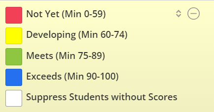
Select from the sort, color swatch, and suppression options to adjust the display.
-
Click a color swatch to hide results for the corresponding performance band, then click Apply swatching.
-
Click the empty color swatch to suppress students without scores, then click Apply swatching.
-
Click the sort icon in the header, then choose the desired sort order.

-
Click the expansion toggle to display the color association labels. Common assessments also display the cut score and minimum values.

-
Click the column header and drag the column to change the order of the assessment columns.
-
Select filters
Choose from the Filter Options.
You must select Student Filter or My Student Groups. You cannot filter by both at the same time.
The My Student Groups filter is only available to teachers.
Student filter
Select Student Filter to apply or create custom filters.
Use student filters to choose the students you want to display in a report. Follow this procedure to filter students, use a saved student filter, create a new saved student filter, or update an existing saved student filter.
-
Click Add Filter.
-
To use a saved filter, choose from the Saved Filters. If you select a saved filter, you can skip to step 10 and apply the filter or add more filter selections in the following steps.
-
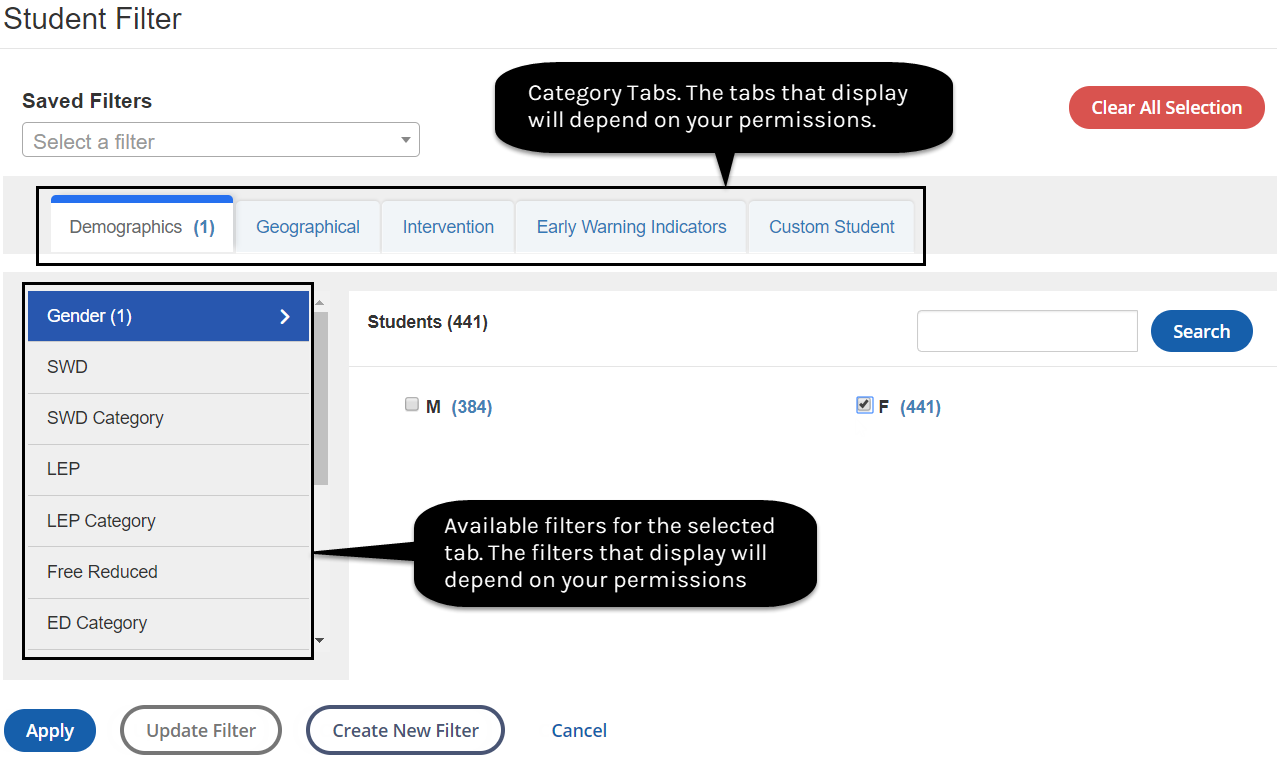
Click a category tab to display the related filters.
-
Click an available filter to display its options. In the following diagram example, the Gender filter is selected in the Demographics category.
-
Optionally, use the Search to narrow the scope of options.
-
Select the desired filter options. In the diagram, the F (female) filter is applied.
-
Optionally, select additional filters from the tabs as needed.
-
If you use a saved filter, click Update Filter to make changes. You can only update filters to which you have update permission.
-
If you want to save your current filter selections to use later, click Create New Filter and follow the prompts to name the filter.
-
Click Apply to add the filtered choices to the report.

The numbers in parentheses indicate the number of selected attributes. For a category tab, the number in parentheses indicates the number of related filters you selected. For a filter, it indicates the number of options you selected. For a filter option, it indicates the number of students. The number of students displayed by a filter option takes other selected filters into account.
My Student Groups
Select My Student Groups, then select a group to filter the report.
-
The student count updates to reflect the applied filters.
-
If you select more than three filters, an ellipsis displays with the number of additional filters.
Select demographics
You can add demographic and geographic column headers to display supplemental information.
The available column headers are determined by the filter security set for your role.
-
From the navigation menu, choose Reports, then Baseball Card Report.
-
Click Manage Columns or click the columns icon in the Student Name column.
-
Select the columns you want to add, and then click Apply.
-
Optionally, to remove a column, clear the selected column, and click Apply.
Display aggregated data
You can display aggregated data by a variety of attributes.
-
From the navigation menu, choose Reports, then Baseball Card Report.
-
Click Manage Columns or click the columns icon in the Student Name column.
-
Clear the Student Name and Student ID column selections.
-
Click Apply.
The remaining columns display the aggregated data.
Compare assessments
You can compare two assessments using a comparison chart for data visualizations and interpretations. To create a comparison chart:
-
From the navigation menu, choose Reports, then Baseball Card Report.
-
Select two or more assessments from the folders.
The comparison chart only compares assessments that have numeric score values.
-
Click Comparison Chart.
-
Optionally, scroll with your mouse to zoom in and out of the chart.
-
Hover over a data point to display additional information including the total number of students, the assessments, and the student names.
-
Optionally, choose from the following to interpret data:
-
Add 45 Degree Line: This default option adds a 45-degree line to the chart. Clear the selection if you want to remove the line from the chart.
-
Show Regression Line: Select to include a regression line.
-
Horizontal Measure and Vertical Measure: Choose the assessment to display for each axis. If more than two assessments are pre-selected, you can choose from any of those assessments.
-
Add Student Filter: Select if you want to filter the student population.
-
Select Student Attributes: Click to select student attributes to compare subgroup performance on the chart. All student filters used by the district are available, including demographic and geographic filters, Performance Matters Interventions, Early Warning Indicators, and custom student filters defined by the district. You can choose attributes for up to eight distinct subgroups.
-
Download: Click to download an image file of this chart.
-
-
Distinct colors of selected student attributes display the performance of students with the given attributes colored differently against the overall chart population to display growth over time. These colors are static and are not associated with any performance band or performance coloring.
-
For very large data sets within student populations, there will be groups of students at given data points. In this case, the bubbles are larger and more transparent, indicating the greater number of students represented within the bubbles. As the student count decreases, the bubble size decreases and darkens. Concentric circles indicate subsets of the population at the given data point with different selected attributes. Gray dots indicate instances of student data overlapping multiple attribute subtypes that cannot be accurately colored for any attribute.
Examples of use cases
The following examples illustrate using Select Student Attributes of the Compare Assessments scatter plot. The data visualizations of assessment results can help determine the best next steps for student growth:
-
Compare local assessment results over the course of the school year in a formative manner by highlighting subgroups and how those students performed compared to the entire student population.
-
For those standards that are challenging across the district, identify teachers who successfully moved students forward through effective instructional decisions, and then determine professional growth opportunities to share instructional strategies with other teachers.
-
Compare performance on a final local common assessment designed to determine if students have achieved mastery of standards with actual performance on a state assessment to determine if local common assessments are appropriately aligned with the state assessment.
-
Use comparisons to establish accurate performance bands and determine if the cuts and coloring chosen for periodic benchmark assessments accurately make informed decisions that are indicative and predictive of state assessment results.
Export and share reports
Use the export and share features to preserve a snapshot of the data you are currently reviewing.
Export reports
Exported reports include the information as it displays when you export the report. Be mindful of any sensitive data if you choose to share an exported report. Anyone who views the report will see the data as it was displayed when exported.
-
From the navigation menu, choose Reports, then Baseball Card Report.
-
Click Download to export the report to a spreadsheet.
Share Reports
-
From the navigation menu, choose Reports, then Baseball Card Report.
-
Click Share to generate a shareable link for the current report.
-
Copy and paste the URL to share the report.
Users must to log in to display this report and must have permission to access the data shared in the report. Only data and students that they have permission to display will populate. The link generates a dynamic report and displays current data each time users access the report.
Assign permissions
District administrators can secure folders and restrict access to sensitive information by role. Users without the necessary permissions cannot display restricted folders in the Baseball Card report.
If permissions are not assigned, all folders are available to users. If permissions are assigned, only users in the assigned groups can display folders to which their permissions grant access.
-
From the navigation menu, choose Reports, then Baseball Card Report.
-
Click the lock icon for the respective folder to manage security permissions. An active icon indicates that some permissions are already established for the folder group.
If you secure a folder, then all sub-folders nested in the main folder are also secured. This hides these folders from users or groups that do not have the necessary permissions.
-
Click Add Group.
-
Search using any combination of Group Type, Organization, Description, or User's Groups.
-
Select a user or group.
To select more than one user at a time, press and hold the Ctrl key on a PC or the Cmd key on a Mac while selecting.
-
Click OK.
-
Select Access for each user or group to be granted permission.
-
Click Save.
