Overview
The visual representation of a Metric is determined in part by a style template that defines several attributes:
-
Style type
-
Labeling
-
Mouseover (tooltip)
Each template is compatible with a certain number of dimensions (usually one or two). The Portal automatically determines where the data goes, based on the Metric Base Column's type (Dimension or Measure) and column sort order.
Metric template properties
|
Style type |
Labeling |
Mouseover |
|---|---|---|
|
Dynamic Style Types |
All dimensions |
None |
|
Bar |
Primary |
Single measure |
|
Line |
Secondary |
Rounded measure |
|
Meter |
N/A |
Rounded measure with percentage |
|
Pie, Cone, Funnel, Pyramid |
Primary |
Rounded measure with percentage |
|
Scatter |
All dimensions |
Comparison between two measures |
Dynamic style types
Dynamic style templates have these basic features:
-
Resizable and sortable columns — Users can sort on a single column by clicking the heading for that column in the grid; the first click performs an ascending sort, the second click a descending sort. Users can also resize columns by moving the mouse to the right edge of the heading for that column and then dragging (hold down left mouse button while moving the mouse) the sizing bar to the new position, then releasing the mouse button.
-
Ability to use pagination when displaying a grid.
-
Support to define user filters on columns in the grid — Users can clear a single column filter by removing the current value in the textbox or selecting the first item (empty option) in the drop-down list.
Most of these features can be configured either for the whole metric or each column. All dynamic styles support drill links and action buttons.
HTML table
HTML tables are preferable for metrics disaggregated by high cardinality attributes. This style type can display more than two dimensions, as well as several measures, and allows the use of drill links, as well as action buttons and checkboxes.
Dynamic crosstab
Crosstabs are used when you want to pivot the data to display dimension(s) across the X and Y-axis of the table, then list the measures as a value that corresponds to the appropriate intersection of the dimensions on the X and Y-axis. The Column Group property on the dimension's Column Settings within the Query Designer determines whether a dimension is on the X (Primary for Column Group) or Y (Secondary for Column Group) axis. This style type can display more than two dimensions, as well as several measures, and allows the use of drill links, as well as action buttons and checkboxes.
Chart types
Dimensions supported: 1, 2, or 3.
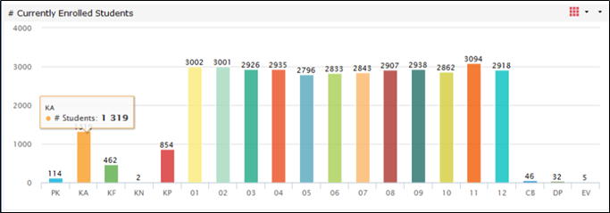
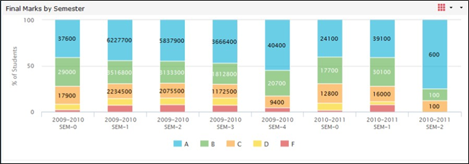
Bar: Vertical, horizontal, stacked, percent, stacked percent.
Bar graphs display the measure associated with each dimension value as a vertical or horizontal bar.
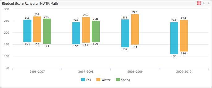
Column range
Dimensions supported: 1 or 2.
Measures supported: 2.
Column Range graphs display the range of measures. Two measures are expected: The low value and the high value. The example shown here is the range of test scores from the students' lowest score to the students' highest score.
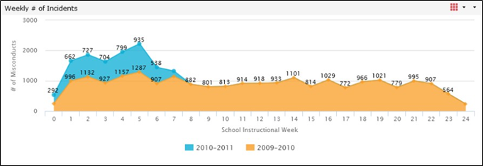
Line and spline
Dimensions supported: 1 or 2.
Line-based graphs link series of data points with lines. When two dimensions are graphed, the data points are split into series according to their secondary dimension.
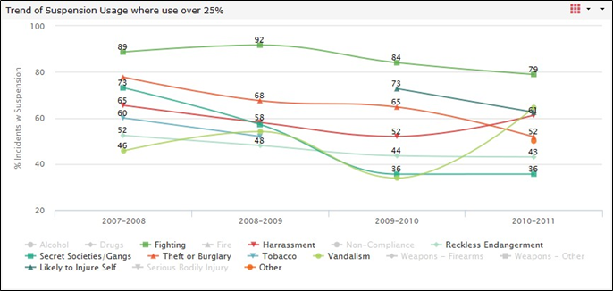
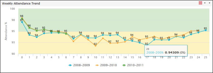
The properties of line graphs overlap significantly with bar and fixed scale bar graphs. These graph types are the most flexible of all the graph types and best suited for longitudinal analyses. Most bar and fixed scale bar templates, and all line templates, place the dimensions on the horizontal (X) axis at the bottom of a metric and plot the measures on the vertical (Y) axis along the left side of the metric.
There are various considerations to make to ensure a bar or line chart accurately conveys the analysis. Most important is the order of the series for cluster bars and lines, as this determines the legends and how the colors are applied to the bars. Also, the measure axis should always be long enough to clearly mark all the variations within the metric. If the graph is too compressed, it may be a sign that there are too many metrics on the dashboard or possibly too many legend items (the second dimension's cardinality of values). Alternately, you can try changing the orientation of the graph from horizontal to vertical or vice versa.
Gauge
Dimensions supported: 0.
Since dials cannot be grouped or disaggregated by a dimensional attribute, they are often limited to the broadest or most focused analyses (i.e., highly filtered dashboards). When using this graph type, several instances of a metric may be required with different filtering to provide the comparative analysis typically desired by users.
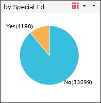
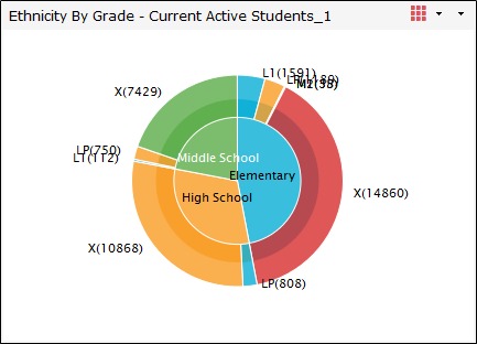
Pie
Dimensions supported: 1 (2 or 3 for grouped pie).
Pie charts are geared toward percentage-type measures like breakdowns of a group of students by grades or ethnicity. Additionally, they are best suited for low cardinality attributes (2 to 6 values) in which few of the "slices" have a small percentage.
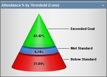
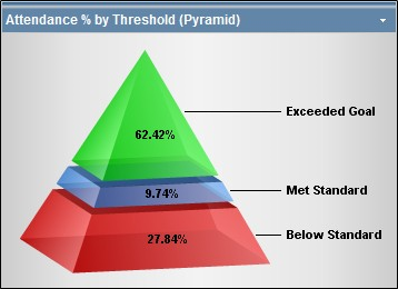
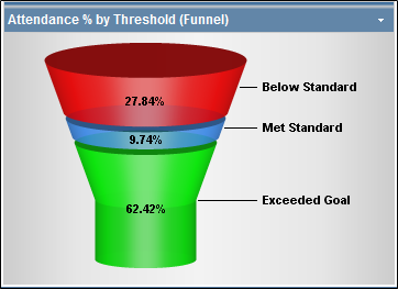
Cone, pyramid, and funnel
Dimensions supported: 1.
Cone, Pyramid, and Funnel charts are geared toward percentage-type measures like breakdowns of a group of students by grades or ethnicity. Additionally, they are best suited for low cardinality attributes (2 to 6 values) in which few of the "slices" have a small percentage.
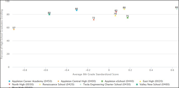
Scatter and bubble
Dimensions supported: 1 or 2.
The scatter is primarily used to compare two measures to each other. For example, compare the number of absences to the average GPA for schools in a district. This comparison is used to identify correlation. A bubble chart allows for one more measure which scales the point based on population.
Area
Dimensions supported: 1 or 2.
Area graphs link series of data points with lines and fill them. When two dimensions are graphed, the data points are split into series according to their secondary dimension.
The properties of area graphs overlap significantly with line graphs.
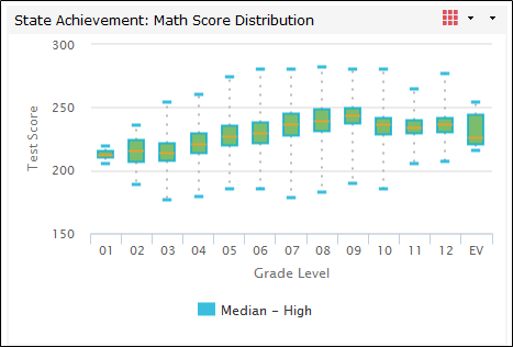
Box whisker
Dimensions supported: 1 or 2.
Measures supported: 5.
Box Whisker charts show the distribution of data. The minimum, bottom quartile, median, upper quartile, and maximum are represented. Typically, statistically calculated outliers are removed from the data set; this is handled within the metric's query definition.
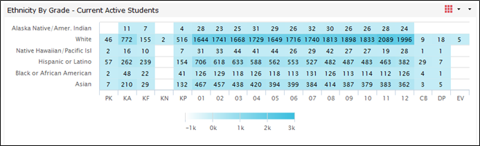
Heatmap
Dimensions supported: 2.
Measures supported: 1.
Heatmaps represent the concentration of a population. The larger the population in a particular cell, the darker the cell color will be.
Mouseover (tooltip)
When the user rests the cursor on an entry in the metric (for example, a bar in a bar graph, a pie slice in a pie chart, etc.), some templates display information (tooltips). The information is either just the measure expressed in that entry of the metric or the measure plus a percentage value representing the contribution that entry makes to the sum of all the entries in the metric. Mouseovers are always labeled with the primary dimension value for that entry.
Beware that some templates round the measure given in the mouse-over to the nearest integer. If the values of the metric's entries are all between 0 and 1 (percentages, for example) this rounding can produce bewildering mouseovers.
The mouseover can be over overridden within the metric's edit properties interface.
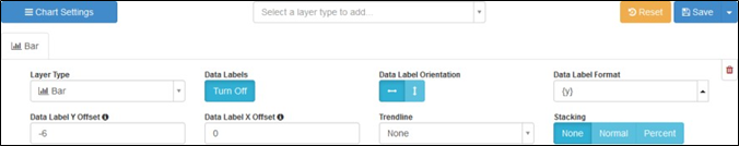
Chart template editor
The Chart Template Editor interface allows you to dynamically edit and preview Chart Style templates. It can be accessed by editing or creating an interactive Metric Style template. Changes visible while editing the template are temporary and will only be saved when you click Save.
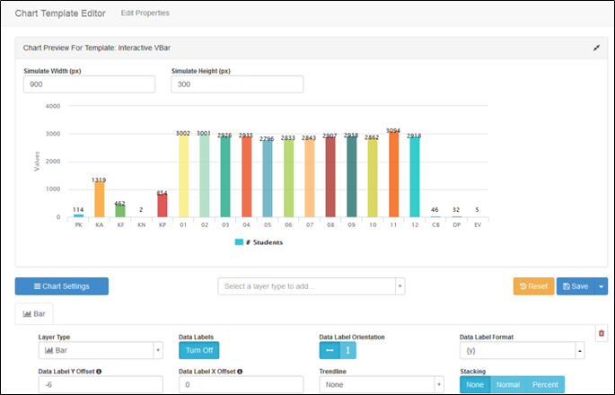
Chart preview
This section in the editor is for previewing the current chart template style. The preview shows what the chart will look like with the selected information and at the simulated width and height. This is a mostly accurate representation of how the chart will look for the end-user.
Chart properties
Chart properties are organized into two categories:
-
In the Layer settings section, you can add and modify layers. The settings controlled here only affect the layer being modified.
-
Click Chart Settings to control the overall chart features.